SouthBridge Consulting Blog
SouthBridge Consulting has been serving the Texas area since 2015, providing IT Support such as technical helpdesk support, computer support, and consulting to small and medium-sized businesses.
Tip of the Week: Using People Graph in Microsoft Excel

Microsoft Excel is a great way for data to be visualized, particularly as it offers various features to highlight the context of the data you’re trying to communicate with. Today, we wanted to walk you through how you can use one such feature—People Graphs—to do so particularly impactfully.
What are People Graphs?
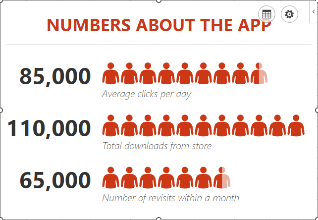
People Graphs are a Microsoft Office Add-In that allows you to create a quick data visualization. While the default icon included in the People Graphs is, predictably, a person, the graphs can be customized to display different icons—from a star, a heart, a clock, a bag of money or various others.
Let’s go over how you can create these simple graphs to present simple data points to your advantage.
Creating a People Graph
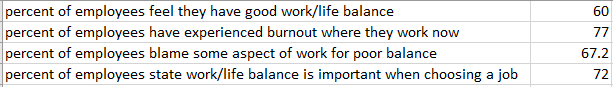
First, you need to have the data you want your People Graph to depict in your spreadsheet. Let’s assume that you wanted to share some statistics concerning the work/life balance habits of today’s workers. In one column, list out the stats you want to share, and in the next, list out the numerical values associated with these statistics.
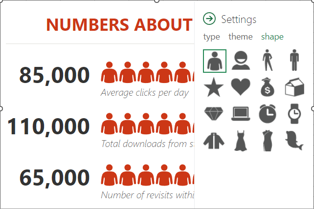
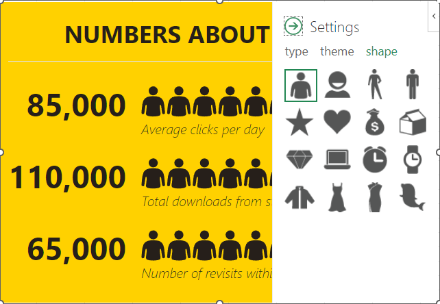
Select this data range. Then, in the Insert toolbar, select People Graph under Add-Ins. A premade graph will appear on your sheet. Select the Settings option, which will appear in the top-right corner when you click on the graph.
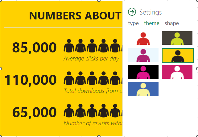
From there, you can customize what your graph looks like, its color scheme, and the shape of the icon itself.
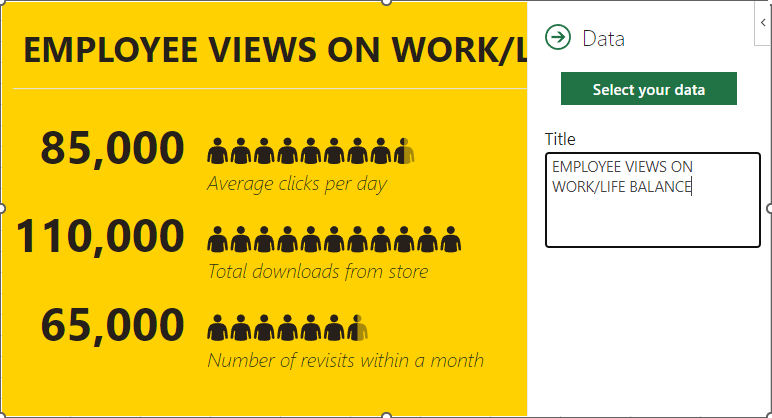
Once you’re pleased with the appearance of your graph, you can then select the grid button that appears next to the settings option. From there, you can customize the title and select the data that your graph pulls from.
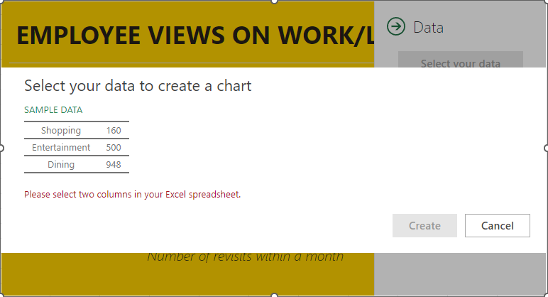
Once you’ve selected the data, click Create, and your People Graph is complete.
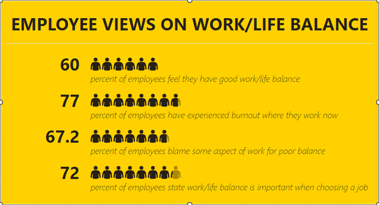
Hopefully, you find plenty of use out of this capability!
Stay Informed
When you subscribe to the blog, we will send you an e-mail when there are new updates on the site so you wouldn't miss them.
About the author
Mobile? Grab this Article
Comments